Justification (typesetting)
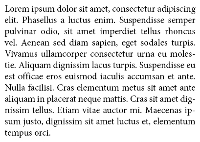
When justification is in typography to improve the way to set a text so that the lines are brought to the same width. For texts in the Latin alphabet, this is done primarily by expanding the spaces between words.
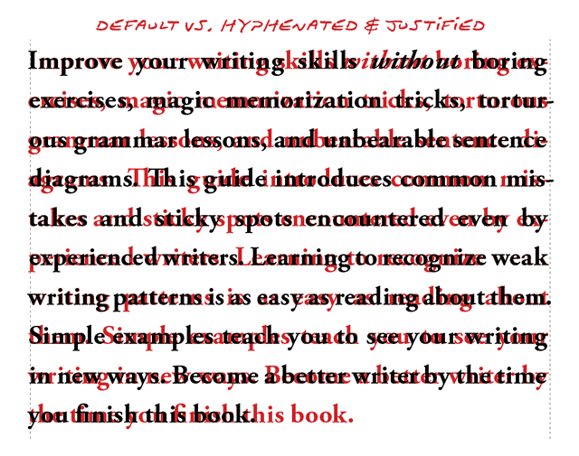
The edges were visually aligned on both the left and on the right side. However, you can often find on closer examination that thin characters ( like a hyphen ) and round characters ( like the letter "o" ) in reality protrude minimally above the actual edge of the text because doing optical the optical impression of conciseness by a deception even strengthened; so also in the example shown opposite.
The last line of a formatted justified text is oriented normally to the left paragraph margin, and the text will run for the remainder of its length out. In rarer cases, to achieve, for example, in some poems or a special optical effect, the last line can also be centered on the column width.
The first line of a paragraph is often slightly indented to make the paragraph beginning even in the case shows that the last line of the previous paragraph by chance ( almost) occupies the entire width.
From a forced justification occurs when the last line of a paragraph will be extended to the full line length.
Methods for the design of the block set
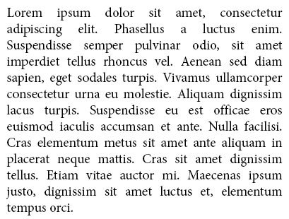
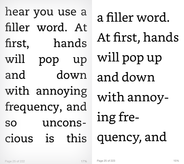
At block set should be taken to ensure that does not become too large gaps between words. These "holes in the text " are caused by too few characters per line; therefore the number of characters per line (including spaces) should not be less than about 40, when it is typographically challenging texts. In the newspaper industry, the lines are but almost universally around or below this size, because the block set then brings his real advantage to advantage.
To resolve this contradiction, several methods are possible to make the words appear as harmonious as possible and evenly. In particular, in the electronic record can of automatic features of modern word processing and desktop publishing programs and fonts (fonts and their font weights) be exercised. The optical quality of the block set is generated programmatically but caused very different.
- Increased word division at the end of the line
- Changed word spacing, both methods are collectively referred to as exclusion: Expelling increases the spaces between the words
- The introduction reduces the word spacing
- The expansion (set locked) by increasing the spacing between the letters
- The condensation of ( closely set ) by decreasing the spacing between the letters
Application
Typical applications of justification are the texts in newspapers, magazines and books. In other printed matter is, amounts of text dependent applications you use and the intended effect, on a case by case basis to decide between justified, ragged and middle axle set. In Web Design Justified is rather unusual because no automatic hyphenation at end of line is possible and therefore easy long gaps in the text may be produced.
The optical image of the block set strikes the onlooker harmonious and therefore "beautiful." However, the strict alignment of the line calls the reader's eye to a high concentration. Also, the detection of individual words is difficult for the eye when the word distances are larger than usual. The focus of the eye is normally on a word plus each of the last / first two letters of the previous or the following word. In order to achieve a peaceful flow of reading, you should make sure that the word spacing is not too large fall in a block set, otherwise eye fatigue and it is difficult for the reader to grasp the contents. In principle, one estimates the justification, because it completely fills the type area. In single-column set, he finds more for aesthetic reasons apply, but in the multi-column set it is essential to make the column boundaries are obvious advantage. In modern -column layout of the justification for the reasons listed above is not so often used. The pleasant flow of reading is in the foreground (design follows function ).


